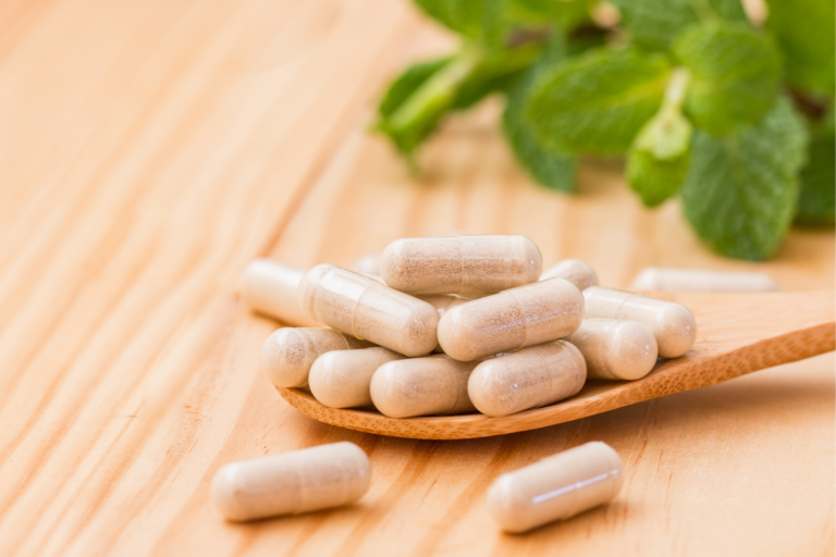
Color is critical in how consumers perceive product packaging, especially in the competitive supplement market. Packaging colours can influence purchasing decisions by evoking specific emotions, building consumer trust, and reinforcing a brand’s personality. Understanding color psychology in supplement packaging helps businesses create packaging that aligns with brand identity, appeals to target consumers, and supports brand positioning.
This guide explores how different hues—from calming colour palettes to vibrant hues—impact consumer psychology, brand recognition, and the visual appeal of product packaging. It also outlines how packaging design and color scheme choices can shape consumer perceptions, communicate brand values, and support cost-effective strategies for standing out in various product categories.
Why Color Matters in Supplement Packaging
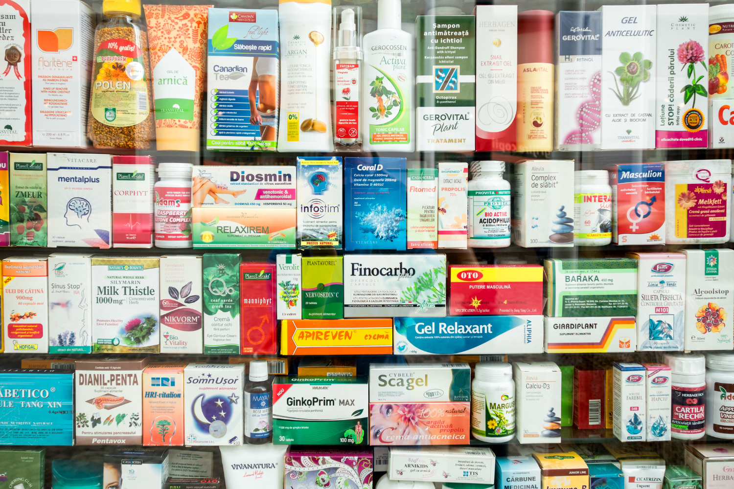
Color psychology in supplement packaging is critical in how consumers respond to a product. Packaging design isn’t just about appearance—it shapes consumer perceptions and guides purchasing decisions. Different colours and shades create visual cues that help potential customers connect with a product’s purpose, quality, and effectiveness. Packaging colors can also support a brand’s identity, help a product stand out on crowded shelves, and communicate brand values without using words.
Here’s how color influences supplement packaging:
- Colors evoke emotions and psychological responses: Warm colors like red and orange stimulate appetite and energy, while cooler tones like light blue and green create calming colour associations and convey trust.
- Color choices help differentiate brands: Strategic use of packaging colours supports brand positioning and helps consumers recognize your product quickly. A unique color scheme can make a brand stand out in a saturated market.
- Color affects how benefits are perceived: Certain colors suggest specific product benefits. For example, blue packaging may imply cognitive support, while health green signals eco-friendly or plant-based ingredients.
Color Meanings & Their Impact on Supplement Packaging
Packaging colours carry different meanings and can shift how consumers perceive a product’s quality and purpose. Understanding the connection between color psychology and packaging design helps brands select the right shade to reach their target market and strengthen brand recognition.
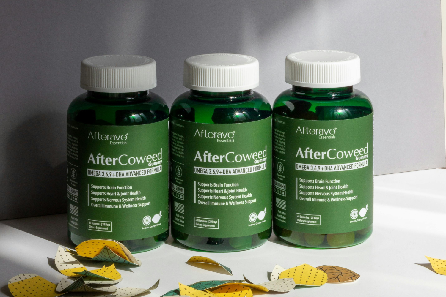
Green – Natural & Health-Focused
Green packaging is closely linked to health, wellness, and the environment. This shade is commonly used for eco-friendly products, plant-based supplements, and items marketed as clean or organic. Health green conveys clarity, is associated with nature and sustainability, and appeals to consumers who value natural ingredients. Many brands choose green to reflect their brand values and align with trends in wellness and clean living.
Blue – Trust & Reliability
Blue packaging suggests professionalism and dependability. These are often chosen for products marketed in the cognitive support or pharmaceutical space due to their association with trust and professionalism. Light blue tones make a product feel clean and clinical, while darker shades give a more established, secure impression. Blue is commonly used in product categories that rely on credibility and expertise.
Red – Energy & Performance
Red packaging is often associated with energy and intensity. It’s frequently used to attract attention and convey boldness, especially in fitness or performance product categories. This color is often used in athletic supplements like pre-workouts, fat burners, and performance enhancers. Red supports a brand’s personality when targeting fitness-minded consumers and helps products stand out with bold, vibrant colors that signal strength and action.
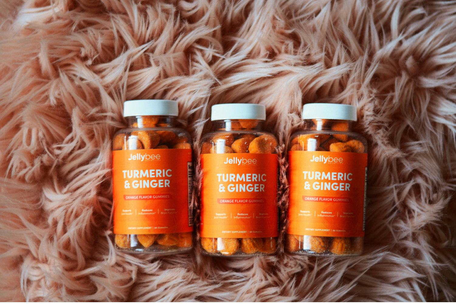
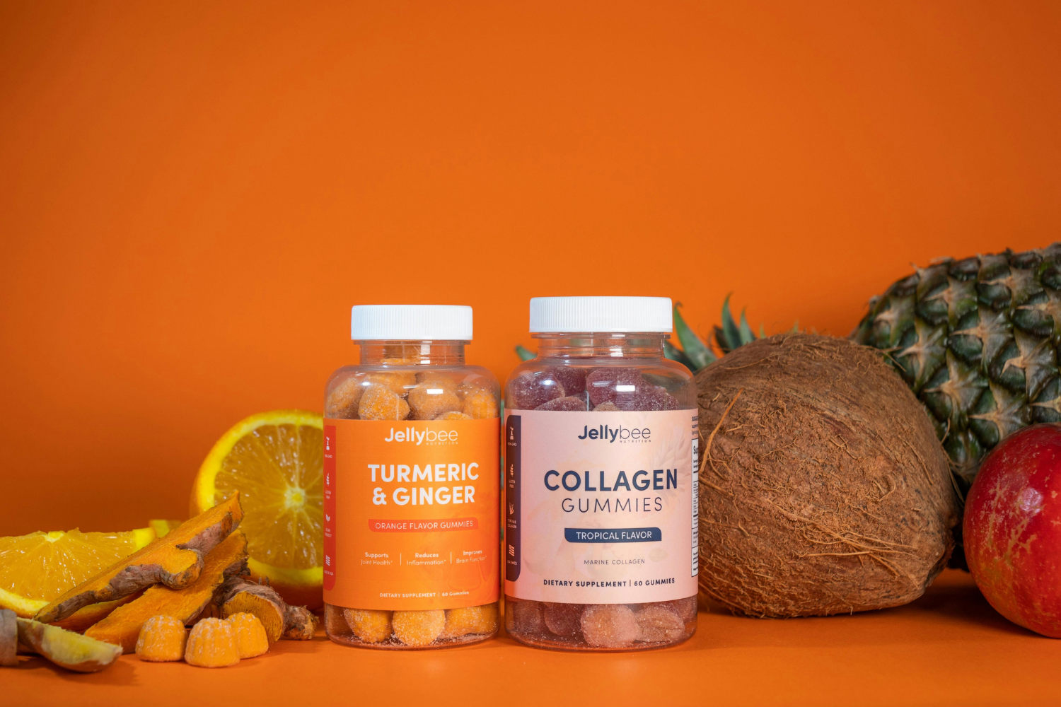
Yellow & Orange – Positivity & Vitality
Yellow packaging and orange tones are associated with optimism, vitality, and fun. These brighter colours create a friendly, approachable look that appeals to a broad audience. Brighter shades are commonly seen in multivitamins and children’s supplements, where a bright, cheerful look is used to convey positivity and energy. These warm colors evoke feelings of happiness and energy, making them effective for health products with uplifting benefits.
Black – Luxury & Sophistication
Black packaging is often used to position a product as premium or high-end. It conveys exclusivity, authority, and refined brand identity. High-end brands use black to highlight quality ingredients and unique formulations, especially in anti-aging, performance, or specialty supplements. In retail, black stands out with a sleek, modern look that suggests strength and elevated value.
White – Purity & Simplicity
White packaging signals simplicity, transparency, and cleanliness. It is often used for supplements marketed with a focus on transparency, simplicity, and clean-label positioning. Many brands use white to emphasize trust and safety, especially when targeting health-conscious or female consumers. This color combination gives a clear, clinical feel that aligns with products marketed as pure and honest.
Purple – Innovation & Wellness
Purple packaging suggests creativity and a more holistic approach to health. It is often seen in herbal or wellness products for relaxation or nighttime use. Purple reflects a blend of science and spirituality, making it appealing to target consumers looking for alternative or mind-body wellness solutions. This shade helps brands create thoughtful, calming, and modern packaging.
How to Choose the Right Colors for Your Supplement Brand
Selecting the right packaging colors is key to building a strong brand identity. The right shade can help connect your supplement product with the right target market and reinforce your brand values. A strategic color scheme improves brand recognition and influences how consumers perceive your product’s purpose and quality.
Know Your Target Audience
Color choices should match what your target consumers prefer and expect. For example, female consumers may respond better to softer shades or calming colour palettes, while younger audiences might be drawn to vibrant hues or brighter colours. Knowing how different demographics respond to color influences can help you choose packaging colours that appeal directly to potential customers and increase engagement.
Consider the Product’s Function
The function of your supplement should guide your color decisions. Use packaging colors that reflect the product’s benefits. Calming formulas like sleep aids might use purple packaging or light blue tones, while energy-boosting products can use red or orange packaging to stimulate attention. Matching colors to product categories ensures the visual appeal aligns with how consumers perceive the supplement’s effect.
Stand Out on Shelves & Online
A unique color combination can help your product packaging stand out in retail and digital spaces. While many brands use common colors, selecting different hues or mixing vibrant colors with darker shades can make your product more visible. The goal is to draw attention while still fitting within the expectations of your target consumers.
Ensure Brand Consistency
The packaging design should reflect a cohesive color scheme across your entire brand. Consistent packaging colours on labels, product containers, and marketing materials help reinforce brand recognition. A consistent approach also builds consumer trust by creating a clear and reliable visual identity for your brand.

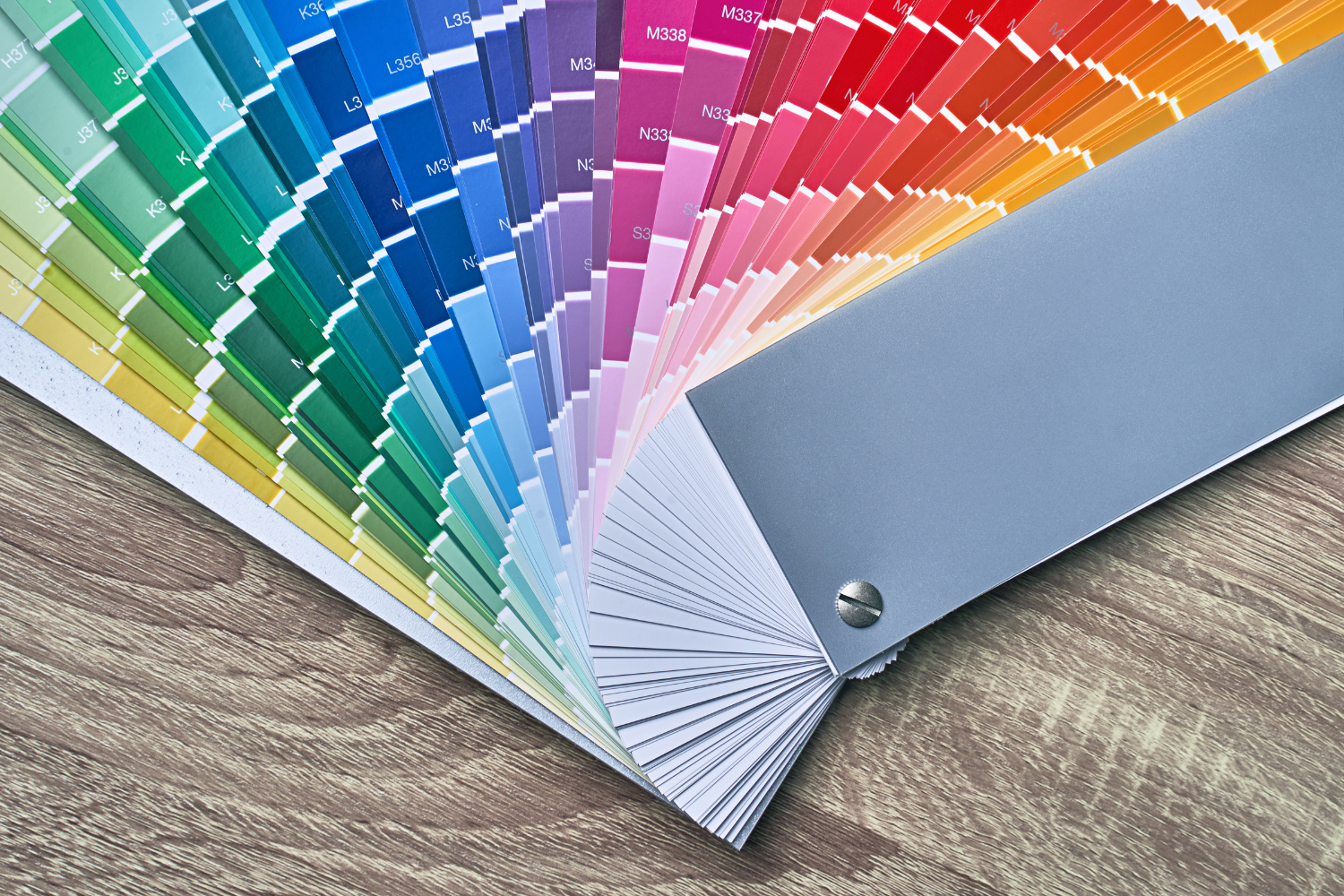
Combining Colors for Maximum Impact
Effective packaging design often involves more than one color. A well-planned mix of colors can increase visual appeal, improve brand positioning, and influence purchasing decisions. Understanding how different color combinations work can help create packaging that reflects your brand’s personality and stands out in the supplement market.
Complementary Color Schemes
Complementary color schemes use opposite colors on the color wheel to create contrast and draw attention. These combinations, such as blue and orange or red and green, are commonly used to make key design elements pop. They can enhance call-to-action areas or highlight specific product benefits. This strategy works well when trying to catch consumers’ eyes quickly.
Analogous Color Schemes
Analogous colors sit next to each other on the color wheel, producing a more blended, natural look. For example, shades of green and yellow can create a healthy, fresh feeling for food products or eco-friendly supplements. This approach supports a smooth visual flow and is ideal for brands creating packaging with a calm, unified tone.
Monochromatic Designs
Monochromatic packaging uses different shades and tones of a single color to create a clean and modern appearance. For example, various blues or greys can convey professionalism and clarity. This method works well for high-end brands or supplements focusing on simplicity, minimalism, and trust.
The Role of Color in Label Design & Branding
Color doesn’t just shape the package’s appearance—it also plays a critical role in label design and overall branding. Strategic use of color in labeling helps convey brand values, highlight product benefits, and improve usability. Visual cues created through packaging colours can directly affect how consumers respond to a product and how well they remember your brand.
- Call-to-action elements: Using color psychology in supplement packaging can guide attention to specific parts of the label, such as dosage instructions or promotional offers.
- Readability: High-contrast color combinations between text and background improve readability and clarity, which can support informed purchasing decisions.
- Color placement: Smart placement of color on the label enhances how consumers perceive the product and reinforces brand recognition across different product categories.
Common Mistakes to Avoid in Supplement Packaging Color Choices
Choosing the right packaging colours can strengthen your brand’s identity and support consumer trust, but poor color decisions can have the opposite effect. Packaging that doesn’t align with brand values or consumer psychology may reduce visual appeal and make the product less competitive. Color psychology in supplement packaging works best when it’s simple, clear, and consistent with your brand positioning.
- Using too many colors: Overloading the design with different colours or vibrant hues can result in a cluttered look, making it hard for consumers to focus on key details or brand recognition.
- Ignoring color associations: Some color choices may send mixed messages. For example, red packaging on a calming supplement could confuse consumers’ minds and reduce trust.
- Mismatched brand messaging: Choosing colors that don’t match your brand’s personality or product categories can weaken your brand identity and cause confusion among potential customers.
- Not testing across materials: Failing to test color variations on different printing methods and packaging materials can lead to unexpected color changes that affect visual cues and perceived quality.

Testing & Validating Your Color Choices
Before finalizing your packaging design, validating your color scheme to ensure it connects with your target market is essential. Color influences how consumers perceive your product, and small changes in shade or color combination can make a big difference in purchasing decisions. Testing also ensures your packaging performs well both online and in stores.
- A/B testing: Try two or more packaging color variations to see which performs better. This helps identify the most effective packaging colors based on real consumer responses.
- Customer feedback: Ask target consumers about their packaging preferences through surveys or a focus group. Their input can help refine your packaging design and support your brand positioning.
- Market trends and competitor analysis: Monitor how well-known brands in your space use color and adjust your approach as needed. Following trends in packaging colour psychology ensures your product stays relevant while maintaining a unique identity.

Using Color Psychology in Supplement Packaging Design
Understanding and applying color psychology in supplement packaging helps businesses connect with their target audience and build strong brand recognition. Each color choice supports visual appeal, communicates product value, and shapes how consumers perceive the brand.
To increase impact and drive sales, brands should create packaging that uses thoughtful color combinations aligned with brand identity and product benefits. The next steps include testing packaging designs with your audience, analyzing what resonates, and refining packaging colors before launching updates that reflect your brand’s goals.
Frequently Asked Questions
What is color psychology in supplement packaging?
Color psychology in supplement packaging refers to how different colors influence consumer behavior, emotions, and perceptions of a product.
How do packaging colors affect purchasing decisions?
Packaging colors can impact how consumers perceive product quality, effectiveness, and trustworthiness, directly influencing purchasing decisions.
Which packaging color is best for health supplements?
Health green, blue, and white are commonly used for supplements because they convey wellness, purity, and reliability.
Can packaging colors improve brand recognition?
Yes, consistently using packaging colours that match brand values helps build recognition and strengthen your brand identity.
How should brands test packaging color choices?
Brands can test color choices using A/B testing, collecting customer feedback, and reviewing competitor packaging strategies.
References
- Federal Trade Commission. (2012). Environmental Claims: Summary of the Green Guides. https://www.ftc.gov/business-guidance/resources/environmental-claims-summary-green-guides
- Morton, J. (2019). Why Color Matters.
https://www.colorcom.com/research/why-color-matters - Singh, S. (2006), “Impact of color on marketing”, Management Decision, Vol. 44 No. 6, pp. 783-789. https://doi.org/10.1108/00251740610673332
- U.S. Digital Service. (n.d.). The Digital Services Playbook — from the U.S. Digital Service. https://playbook.usds.gov/
- U.S. Food and Drug Administration. (2025). Guidance for Industry: Food Labeling Guide. https://www.fda.gov/regulatory-information/search-fda-guidance-documents/guidance-industry-food-labeling-guide
- U.S. Small Business Administration. (2024). Market research and competitive analysis. https://www.sba.gov/business-guide/plan-your-business/market-research-competitive-analysis